 |
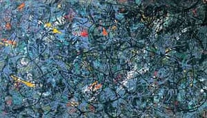
| Untitled |
The Stone Roses
 For the album cover, Squire (the guitarist in the band) produced a painting titled 'Bye Bye Badman' that was his take on the May 1968 Paris riots. Hence the french flag in the painting. The Lemons link to the lemons that were used to neutralise the effect of the tear gas used in the riots. It is a Jackson Pollock-influenced piece. Squire said that "Apart from untitled, I made the album covers on canvasses that are roughly four times the size of a vinyl album." Untitled was used on the front of their greatest hits album
Source - https://www.theguardian.com/music/2004/may/13/stone-roses-john-squire-art

Pink Floyd - Dark Side Of the Moon
Pink Floyd's album covers are pretty famous. The band's light spectrum prism is one the most well known . Initial inspiration came from a was a photo of a prism on top of some sheet music. The prism on the cover is related mostly to a light show, according to the designer of the album cover, Storm Thorgerson. In an interview with RollingStone, he said that "I think the triangle, which is a symbol of thought and ambition, was very much a subject of Roger’s lyrics. So the triangle was a very a useful – as we know, obviously – was a very useful icon to deploy and making it into the prism – you know, the prism belonged to the Floyd." Other famous covers include: The Wall, Animals and Wish You Were Here.
Black Sabbath - Master of Reality
 The album cover features a wavy purple and grey font contrasting against the black background. The first editions of Master of Reality came in an vinyl 'envelope sleeve' containing a poster of the band, and with the album's title embossed in black lettering. Later editions feature the album title in grey. Whilst the design is simple, it is effective and recognisable straight away
 Bowie - The Rise and Fall of Ziggy Stardust and the Spiders From Mars
 The photo was taken outside of 23 Heddon Street, a small, block-long, dead end street in central London; on a rainy January night in 1972. David Bowie posed beneath the now-famous K West sign with photographer Brian Ward. Originally shot in black and white, the photos were later over-tinted, to convey the impression of Ziggy Stardust coming to earth. The over-tinting techniques gives the image a much more artsy look. I'd like to try out creating a similar look in photoshop in preparation for the digipack.
The Clash - London Calling


Source - http://diffuser.fm/cover-stories-london-calling/?trackback=tsmclip
 Initially the plan for the album cover was for the band members to go to the Himalayas and shoot the cover photo there. But their record label, EMI, desperate for the album to be released, and the group were on their last few creative embers. consequentially they settled on a simpler cover: A photograph of the quartet walk through the crosswalk outside their studio on Abbey Road. It was taken around 11:30AM on Aug. 8, 1969. The traffic was blocked, and Iain Macmillan, took the iconic picture on a ladder. The shoot lasted roughly only 10 minutes. Apple Records art director, John Kosh, chose to keep the Abbey Road cover design simple, and decided to not include the band’s name or the album’s title. However EMI chairman Sir Joseph Lockwood was opposed to this decision but it flew off the shelves. The cover produced theories that Paul McCartney died around 1967, and had been replaced by a dopplegänger. Some saw the picture as a funeral procession: John (in white) is the preacher, Ringo (in black) is the mourner, George (in denim) is the gravedigger and Paul (barefoot) is the corpse.

Eddie is the mascot for Iron Maiden. He is a prominent fixture of the group's artwork, appearing in all of their album covers, as well as most of their singles, and in their merchandise, which includes T-shirts, posters and action figures. Originally he started out as a papier-mâché mask used in Iron Maiden's stage backdrop, the band transferred the name "Eddie" from the mask to an illustration by Derek Riggs. The album cover for killers, features Eddie with an axe and his victim clawing at his shirt. The design by Derek Riggs is based on a block of flats in which Riggs lived at the time.

In 1965 Andy Warhol became The Velvet Underground‘s manager and he booked them into New York’s Scepter Studios in April 1966 to record the group’s first album. The cover was entirely his project. Early versions of his famous banana print cover said "peel slowly and see," and there was a peel-away banana sticker that revealed a pink banana underneath. With drug songs on the album like "Heroin" and "I'm Waiting For The Man," some people have interpreted the cover as a reference to a rumor that smoking a banana peel will get you high.

The photographer for the album, Herbert Worthington, was a longtime friend of Stevie Nicks. Stevie is dressed as her stage persona "Rhiannon" a figure from Welsh mythology, with Mick Fleetwood at her side. Desmond Strobel designed the cover, and the calligraphy was done by Larry Vigon.

Having been partying all night at her friend's wedding, Amy arrived four hours late to the shoot for the album. A black room was used in photographer Mischa Richter’s house in Kendal Rise, which had blackboard paint on the cupboards. The image used was the last shot of the day, with early evening light streaming through window to the right.


 The album cover for Led Zeppelin II was created by David Juniper, who was told by the band to come up with an idea that was “interesting.” His design was based on a photograph of a Division of the German Air Force during World War I, The Flying Circus. Led by Manfred von Richthfen, The Red Baron. Juniper airbrushed the photo adding the faces of Jimmy Page, Robert Plant, John Paul Jones and John Bonham taken from a 1969 Led Zeppelin publicity band photo. Juniper said "In amongst the four band members airbrushed in from a publicity photograph are Miles Davis or was it Blind Willie Johnson [it couldn't have been Blind Willie, as there is but one photo of the artist, and this is not him], a girlfriend and muse of Andy Warhol, Mary Woronov, Peter Grant, Richard Cole, and the astronaut Neil Armstrong." Juniper thought he had put Armstrong on the cover but according to some theories he had actually put NASA Astronaut Frank Borman on by mistake. The woman on the album cover is actress Glynis John (the mother of Mary Poppins). Her inclusion in the photo was a play on the name of recording engineer, Glyn Johns. This is another photo that I like, and perhaps like to create a similar style practice cover. Juniper's creativity and ambition makes this album cover more than just a photo but rather a piece of art. The layering and manipulating is really impressive, especially for a time before photoshop, and digital editing.
The Beatles - Abby Road
 Initially the plan for the album cover was for the band members to go to the Himalayas and shoot the cover photo there. But their record label, EMI, desperate for the album to be released, and the group were on their last few creative embers. consequentially they settled on a simpler cover: A photograph of the quartet walk through the crosswalk outside their studio on Abbey Road. It was taken around 11:30AM on Aug. 8, 1969. The traffic was blocked, and Iain Macmillan, took the iconic picture on a ladder. The shoot lasted roughly only 10 minutes. Apple Records art director, John Kosh, chose to keep the Abbey Road cover design simple, and decided to not include the band’s name or the album’s title. However EMI chairman Sir Joseph Lockwood was opposed to this decision but it flew off the shelves. The cover produced theories that Paul McCartney died around 1967, and had been replaced by a dopplegänger. Some saw the picture as a funeral procession: John (in white) is the preacher, Ringo (in black) is the mourner, George (in denim) is the gravedigger and Paul (barefoot) is the corpse.
 Iron Maiden - Killers

The Velvet Underground & Nico

Fleetwood Mac - Rumours
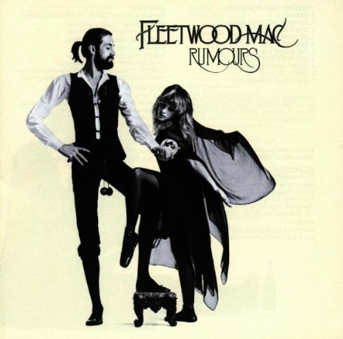
The photographer for the album, Herbert Worthington, was a longtime friend of Stevie Nicks. Stevie is dressed as her stage persona "Rhiannon" a figure from Welsh mythology, with Mick Fleetwood at her side. Desmond Strobel designed the cover, and the calligraphy was done by Larry Vigon.
Amy Winehouse - Back to Black

Led Zeppelin - II
 The album cover for Led Zeppelin II was created by David Juniper, who was told by the band to come up with an idea that was “interesting.” His design was based on a photograph of a Division of the German Air Force during World War I, The Flying Circus. Led by Manfred von Richthfen, The Red Baron. Juniper airbrushed the photo adding the faces of Jimmy Page, Robert Plant, John Paul Jones and John Bonham taken from a 1969 Led Zeppelin publicity band photo. Juniper said "In amongst the four band members airbrushed in from a publicity photograph are Miles Davis or was it Blind Willie Johnson [it couldn't have been Blind Willie, as there is but one photo of the artist, and this is not him], a girlfriend and muse of Andy Warhol, Mary Woronov, Peter Grant, Richard Cole, and the astronaut Neil Armstrong." Juniper thought he had put Armstrong on the cover but according to some theories he had actually put NASA Astronaut Frank Borman on by mistake. The woman on the album cover is actress Glynis John (the mother of Mary Poppins). Her inclusion in the photo was a play on the name of recording engineer, Glyn Johns. This is another photo that I like, and perhaps like to create a similar style practice cover. Juniper's creativity and ambition makes this album cover more than just a photo but rather a piece of art. The layering and manipulating is really impressive, especially for a time before photoshop, and digital editing.
Comments
Post a Comment